


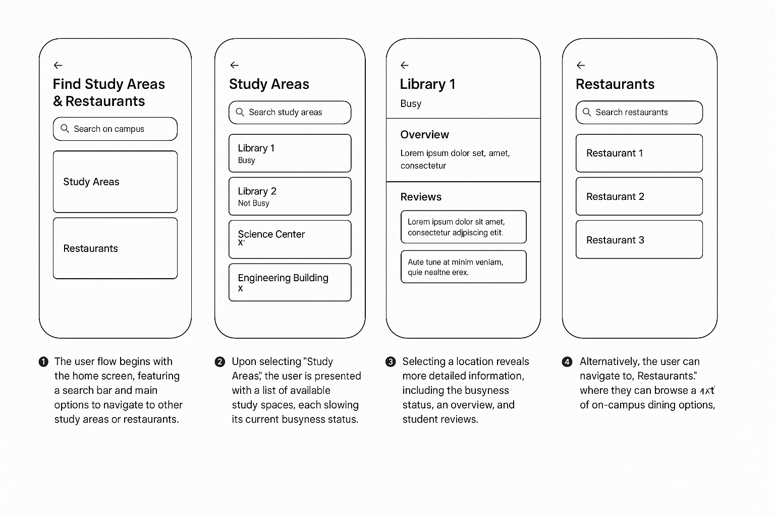
The McMaster Campus App is a mobile UX prototype that helps students locate study spaces and restaurants within campus grounds. It features real-time study space occupancy data based off their official McMaster website and provides food location listings, allowing students to make time efficient decisions between classes or before studying.
Role: UX & UI Designer
Project Type: Academic project for McMaster University
Tools Used: Figma, pen & paper, peer feedback
This was an individual UX design project created for a course at McMaster University. I was responsible for the full process; from user research, wireframing, UI design and prototyping in Figma.
McMaster students often waste time walking to study areas that turn out to be full or struggle to find nearby campus food options between classes.
There was no central mobile solution that offered real-time updates on library busyness or allowed quick discovery of food spots on campus.
To understand student frustrations and daily habits, I conducted informal interviews with peers.
Key findings included:
Students want to know if a study space is busy before they arrive
Short breaks between classes leave little time to explore food options
Students prefer a fast, intuitive mobile tool that consolidates both study and dining needs
Lack of visibility into real-time library occupancy
Unclear or scattered information about on-campus dining
Wasted time and reduced productivity during transitions between study and classes
I explored several ideas to address these issues:
A homepage split into two main paths: Study Spaces and Food Options
Filterable lists to sort by crowd levels, location, or hours
An interactive campus map to visualize nearby options
A page to keep track of your favourite locations
These ideas were first mapped out through sketches and then translated into low-fidelity wireframes in Figma.
The final UI leverages McMaster University’s brand identity, featuring:
Maroon (#7A003C) and gold (#FFCC00) as primary action and highlight colors
Neutral grays and whites for clean, distraction-free screens
Card-based layouts for listing study and food locations
Visual and text-based indicators (e.g. Quiet, Moderate, Full) for accessibility
Tab-based navigation for a familiar mobile experience


The McMaster Campus App prototype provides students with:
Real-time insight into study space availability
A fast, user-friendly way to locate food around campus
Reduced stress and better time management during their academic day
This project taught me how to design with both user needs and brand alignment in mind.
By leveraging McMaster’s visual identity and grounding the experience in student feedback, I created a tool that felt purposeful, intuitive, and highly usable.
If developed further, I would explore adding:
Real-time occupancy data from sensors or student input
Community reviews and ratings for both study and food areas
Pre-order or queue time tracking for food vendors
View my Prototype!

I conducted informal usability testing with fellow students. Based on their feedback, I made the following improvements:
Refined label language for crowd indicators
Improved filtering UX for quicker access
Adjusted spacing and font hierarchy for easier scanning